

                                        Description:
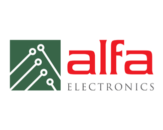
                    The old logo was dated and didn't match the style of their website. Even in the consulting phase it was stressed to me that the client would like a script font. I explained why a script font would not be appropriate for their industry and they were open to change.
I was inspired by circuit board design and use the elements in a board to create an abstract letter "a". Since there is a heavy Italian influence within the company, I chose a subdued green and bold red.                                        


                    As seen on:
                    
                         Alfa Electronics                    


                    Status: 
                    Client work                    
                    Viewed:
                    4168                    


                    Share:  


Lets Discuss
Please login/signup to make a comment, registration is easy