
Float
(Floaters:
0 )
Description:
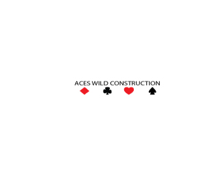
working on my logos, any comments? ALL welcome!
Status:
Student work
Viewed:
916
Share:


Lets Discuss
Charles, have you tried to put rounded corners on the playing cards to better represent an actual deck of cards. Watch your spacing between the %22A%22 and %22C%22 in the word ACES. I'd also drop the word construction down a tad as it seems a little tight to the ace of spades. Alternatively you could have the name of the company run across the bottom of the playing cards on one line. Other than that it's a good start.
Replybullmastiff07,*I agree with everything wiking said. Its a good start, however needs some work.
ReplyPlease login/signup to make a comment, registration is easy