
Float
(Floaters:
10 )
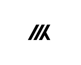
Description:
Personal logo that I made a while back. Still needs some refinement regarding the height/width ratio, but other than that it seems okay to me? Both my initials M and K are in there and I've never seen it before.
Comments and feedback are always appreciated!
Status:
Work in progress
Viewed:
3581
Share:

Lets Discuss
I like it a lot, Marvin, nice job.
ReplyThanks a lot, Sean! Really appreciate it :)
Replythe K needs a lil fixing, i also c the predator face in this mark...:D
ReplyHaha, I'm always hunting for new clients! %3B) But I agree with you. The V form at the top of the K doesn't seem right/slightly unbalanced. I'll work on it, Thanks!
ReplyNice and clever mark..
ReplyThanks alot, Gert! I appreciate it.
Replynice one
ReplyThank you, Colin
ReplyShould be perfectly aligned now
ReplyPlease login/signup to make a comment, registration is easy