
Float
(Floaters:
3 )
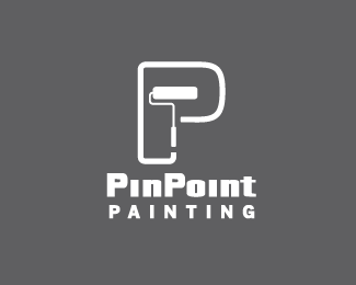
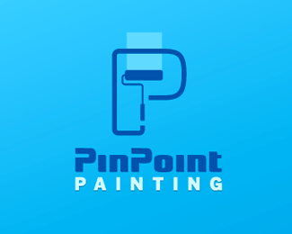
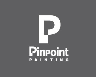
Description:
This is a painting company, they want a more corporate look to give them more credibility, no colours yet, I want to make sure the forms work first, I have to many options and I want to narrow it down to 3, I'm doing my survey but any suggestions will be welcomed, thanks.
Status:
Unused proposal
Viewed:
1911
Share:


Lets Discuss
I think the drips on the left side look a little odd, but i'm digging this one too. what about capping pinpoint? or adjust the leading, because the p is almost touching %22painting%22.
ReplyI'll try that and see what happens, thanks George.
Reply@ gyui, I think works better, really appreciate your view.
ReplyPlease login/signup to make a comment, registration is easy