Description:
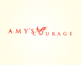
Logo for a charity for battered women and their families. Inspired by a medallion of a maiden holding up a wreath that the charity's founder gives away as a token of sympathy.
Status:
Nothing set
Viewed:
797
Share:




Lets Discuss
The wreath is nice, but there are issues with the text. It should all be one size. The wreath is too high to accurately be the O of COURAGE. Take the widened kerning out%3B the logo is already way too wide. Why is the open area of the first A missing? What is the blob of color near the leg of the R? It seems I see other bits of color scattered under the logo. On purpose?
ReplyI'd disagree. The name is an important part of the logo%3B the charity was founded in memoriam. The widened kerning worked out well when applied (press kits)%3B it wasn't and wouldn't be used on smaller materials. Note that even this version on the showcase is smaller than on actual usage. **The look is somewhat grungy/screenprint-like so the specks you see are from that.**The client (published author) was pleased, and since our last exchange, she was communicating with Oprah's reps to get both her book and charity publicized.**Nonetheless I appreciate your comment.
ReplyPlease login/signup to make a comment, registration is easy